UX Design · 1992–2026
I started with ink,
not pixels.
Thirty years of design practice, set down as a record rather than a pitch. From early Moleskine spreads to shipped SaaS — the same hand throughout.


Personal product · 2025–present · Designed & Coded
Four Degrees Feels Like
Ask for a city, a date and a style; the app answers with people dressed for the weather actually outside. Designed and coded end to end, now on the App Store.
Read the chapter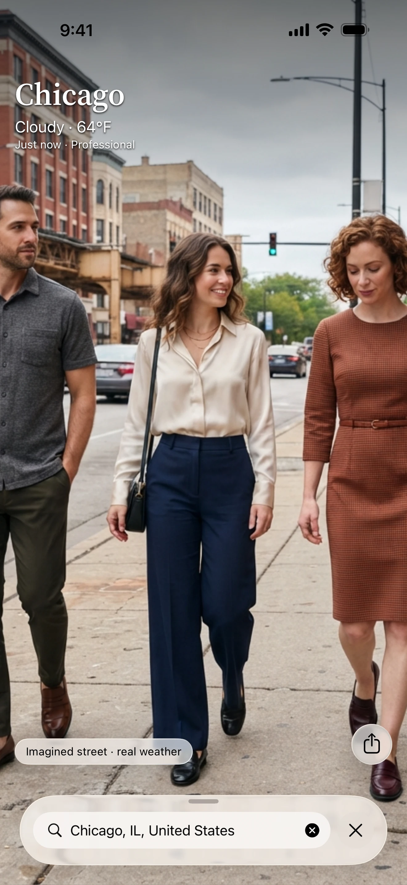

Brizo FoodMetrics · 2021–2025 · Head of Product & Design
Linguini
Brizo FoodMetrics’ core analytics platform for foodservice sales teams, redesigned end to end. A question asked, answered and followed by the next — without leaving the screen.
Read the chapter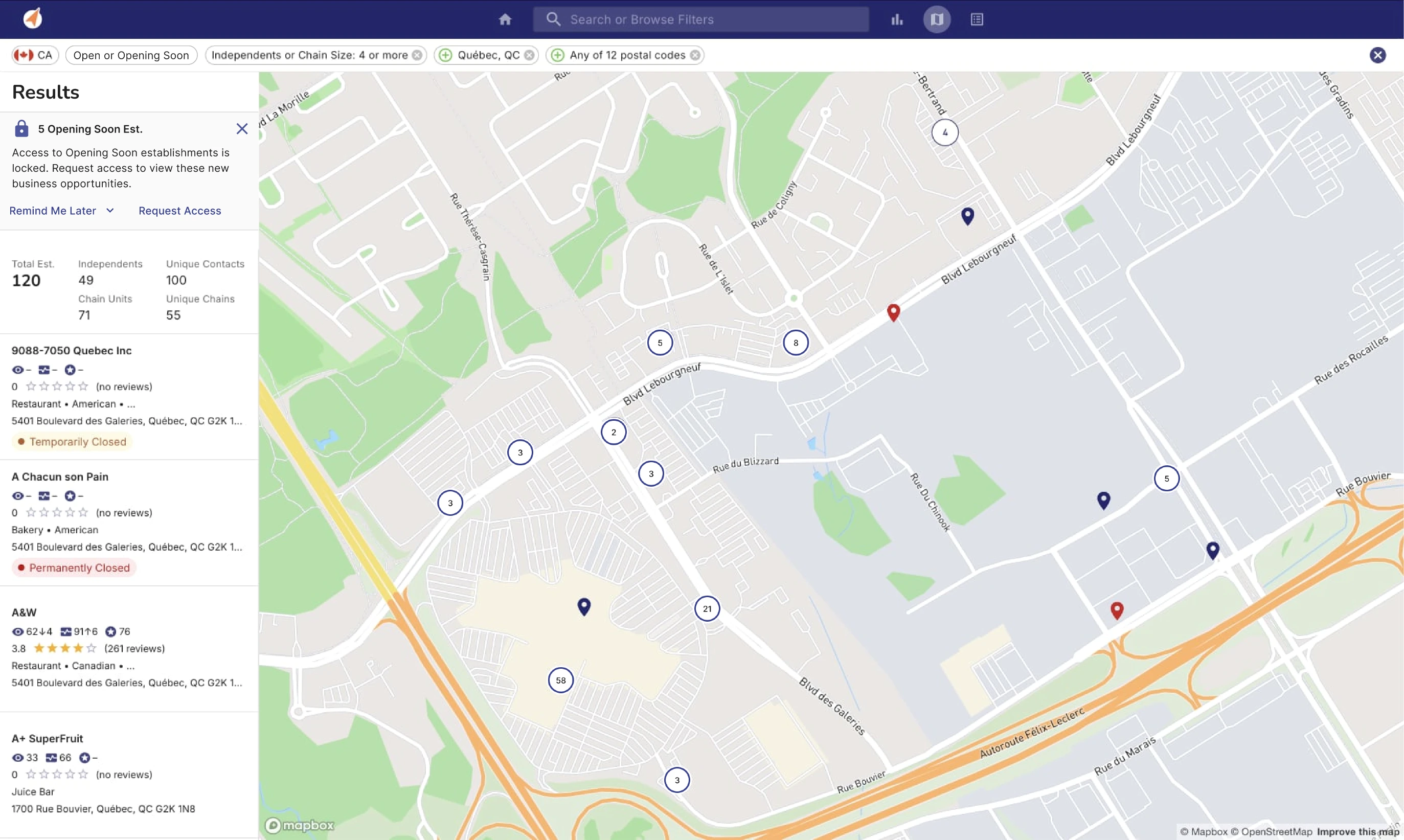
- 3×faster task time after launch
- 5operational statuses, colour-coded on the map
- 90 %feature-request rate on Opening Soon
TELUS Health · 2018–2019 · Designer, NextGen EMR
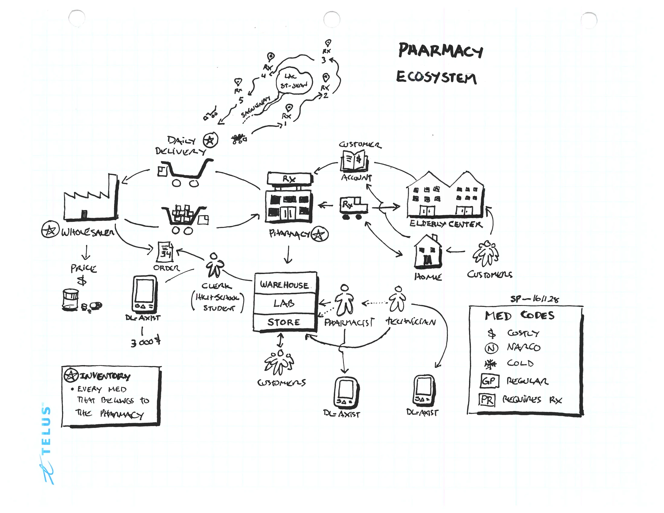
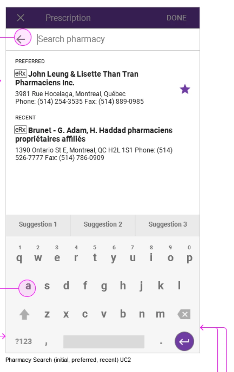
Point of Care
A prescriber module that fed Canada’s national e-prescribing service, built across two acquired products with different data models.
Read the chapter~70%of prescribers in Prince Edward Island’s provincial EMR program had taken up PrescribeIT® by 2023
TELUS Health · 2014–2016 · Designer, Remote Patient Monitoring
Who Needs Me First
The screen a nurse opened each morning to see, across their whole panel, who was getting worse and who needed them first.
Read the chapter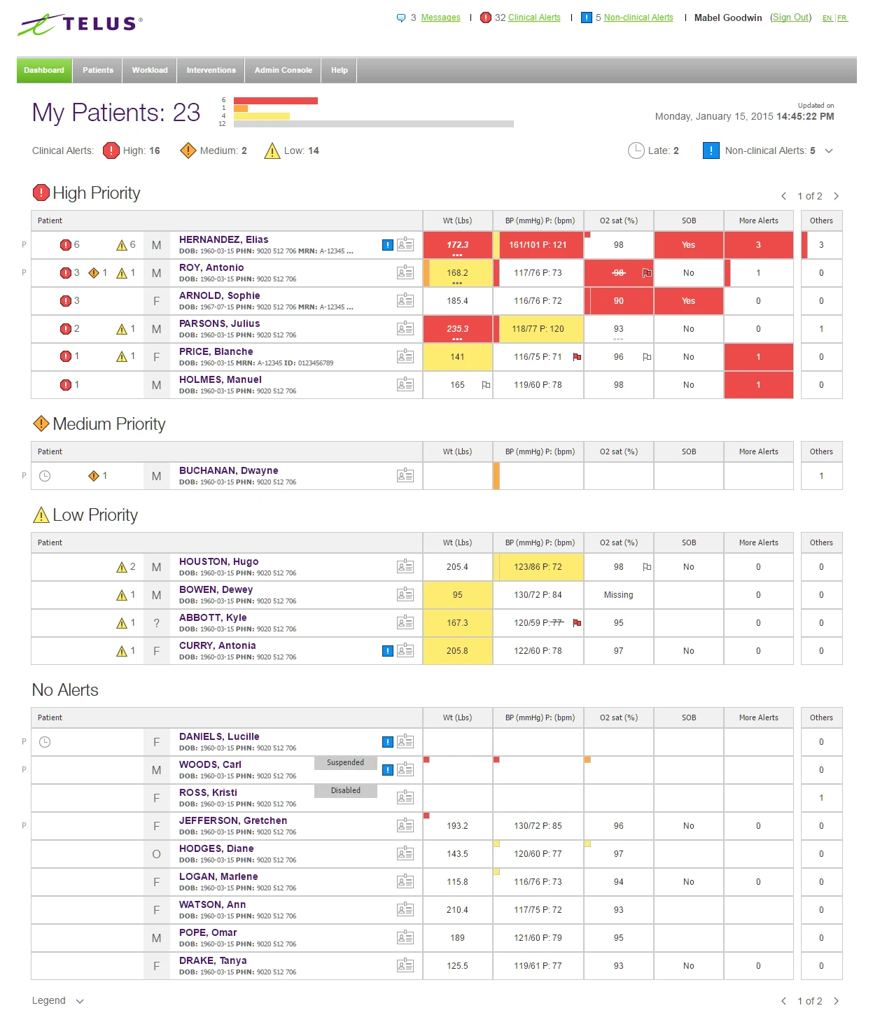
CA Technologies · 2013 · Lead Designer, Identity Platform
Sign In Once
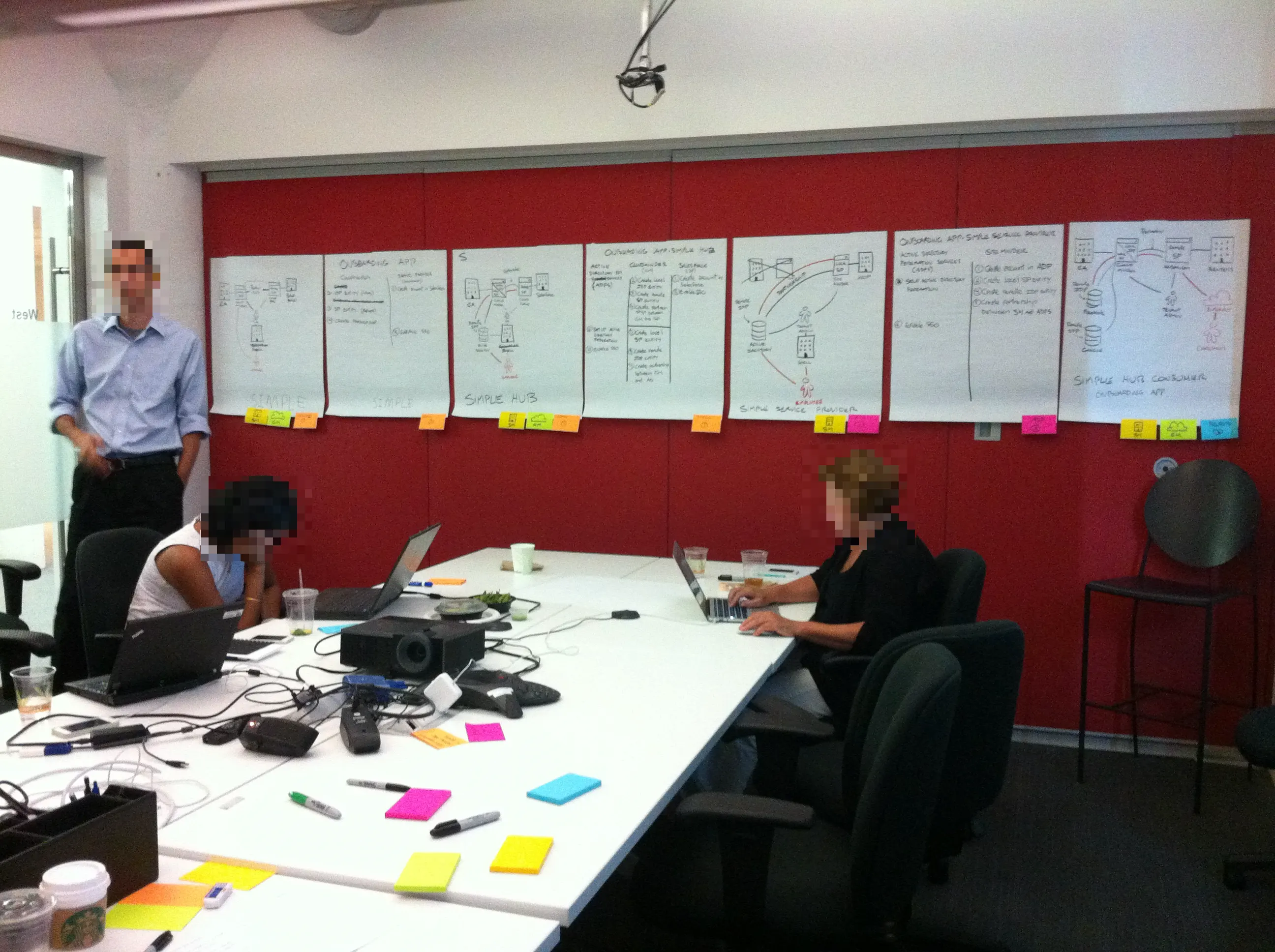
The console had to serve four very different administrators at the same time. We ranked them on a whiteboard, and one interface had to stay obvious to the first without insulting the last.
Read the chapter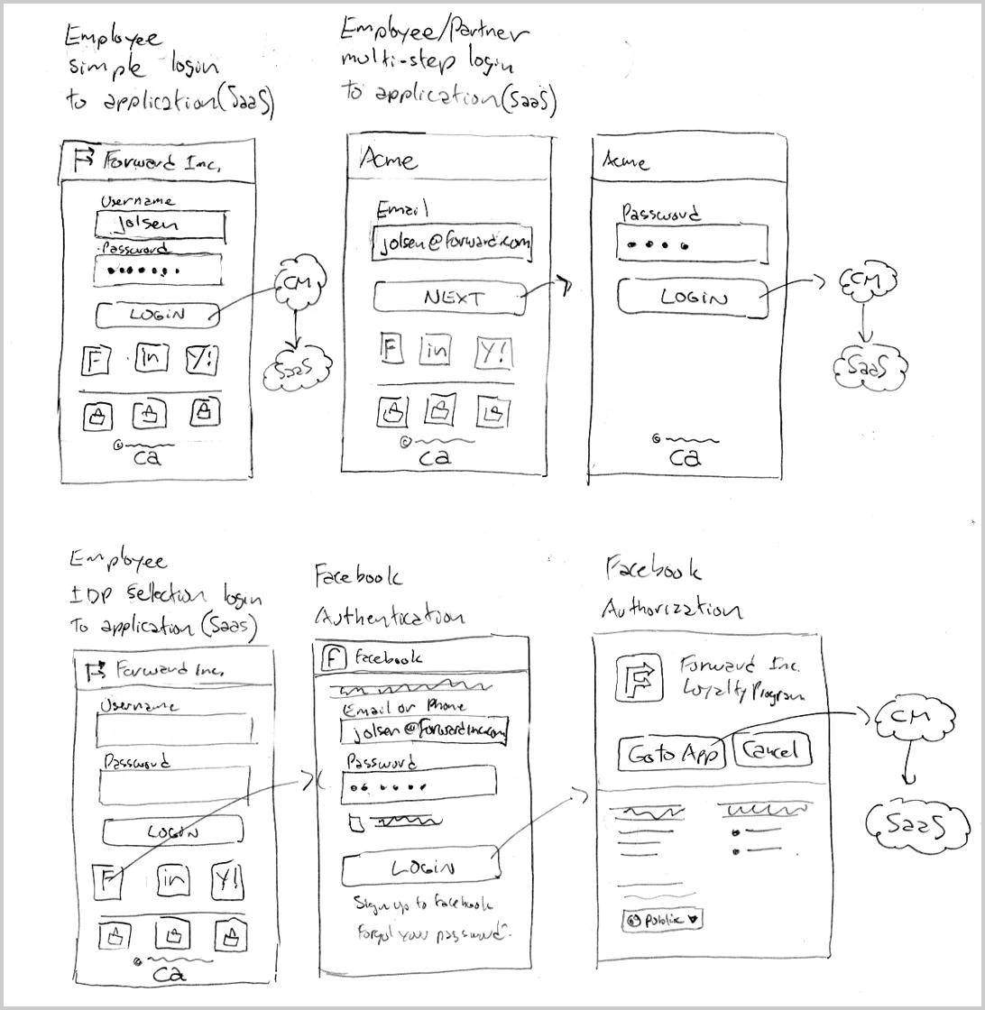
The employee sign-in flows, sketched by hand. Desjardins · 2011–2013 · Senior UX Designer, AccèsD Mobile
The Usable Bank
Shipped on Android first; that reception led Desjardins to commission the iPhone redesign, which carried the same patterns over.
Read the chapter4.5 out of 5on Google Play
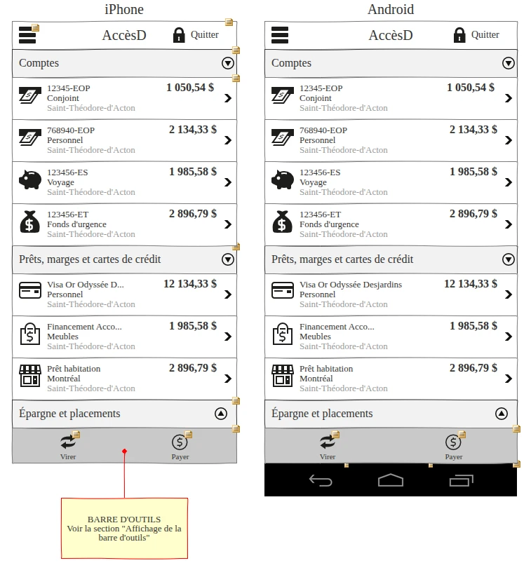
iPhone and Android: one pattern, two platforms. Amazon · 2011–2012 · Senior UX Designer, Browser Toolbar
Permission to Interrupt
Every behaviour argued on paper first, with the alternative written in the margin: “if too intrusive, the popover is not prompted.”
Read the chapter250,000Firefox downloads

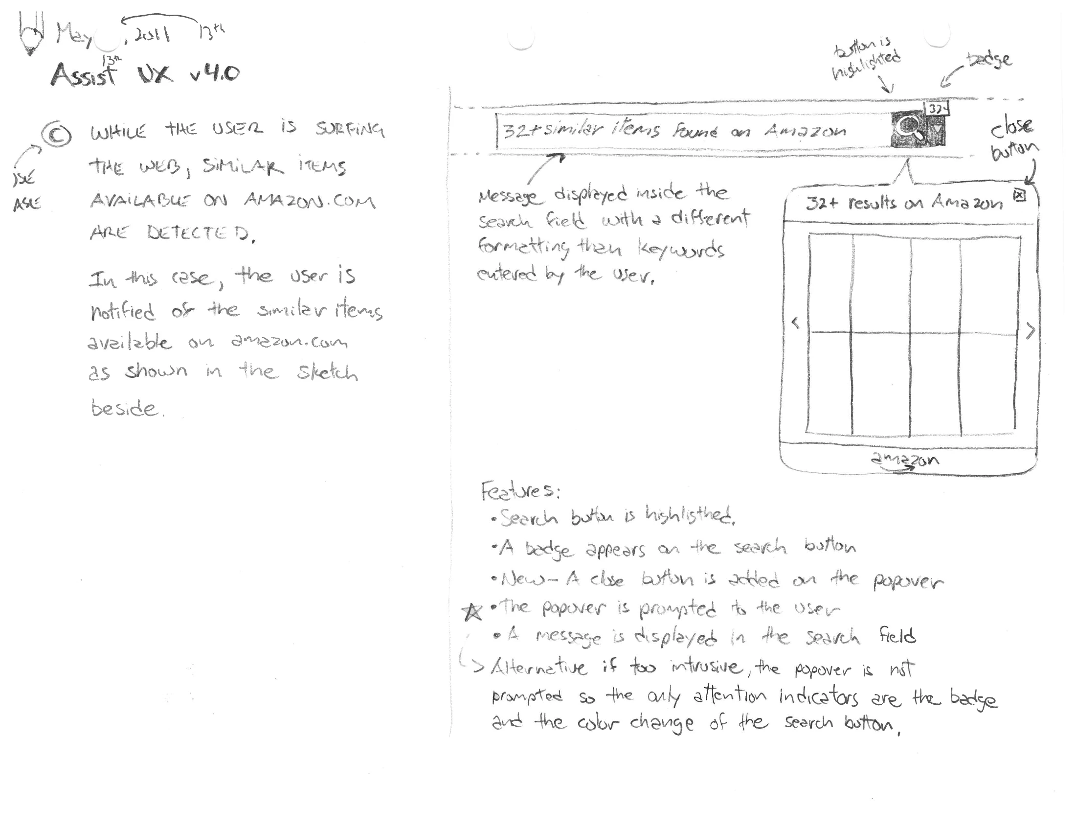
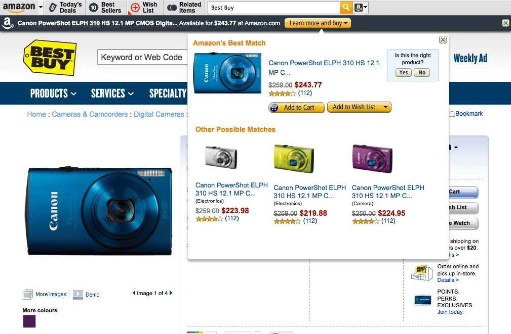
Deal UX v5.0 and Assist UX v4.0, on paper; then the toolbar as it shipped. 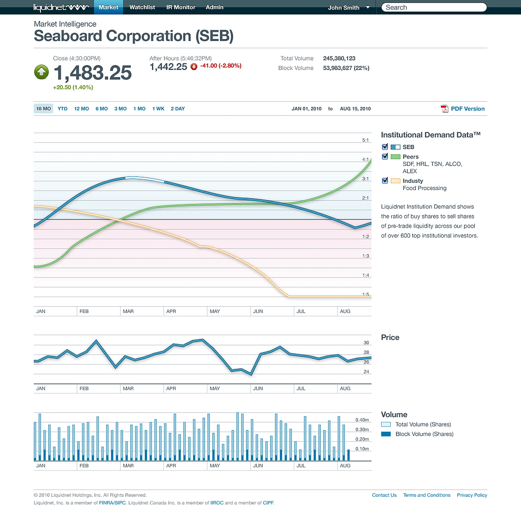
Liquidnet · 2009–2011 · Lead Designer, InfraRed
Lifting the Veil
A public company had its share price and its volume, which is history. It had no read on intent. InfraRed gave it one.
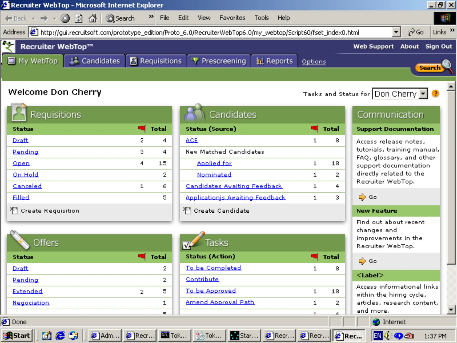
Read the chapterRecruitsoft / Taleo · 1999–2008 · UX Designer, Recruiter Webtop™
One Workspace, and What Came Next
Read the chapter- 6themployee at the startup that became Taleo — and its first designer
- 9years building the recruiter interface from scratch
- 190+countries, with Fortune 500 companies among its users
- $1.9BOracle’s acquisition of the platform, 2012